I just made the first tweeks on my "Sharp Steele" version. Gonna take a look at it now.
AmpGUI DP Themes (now at AMPGUIMODS.NET)
Moderator: James Steele
Forum rules
This forum is for most discussion related to the use and optimization of Digital Performer [MacOS] and plug-ins as well as tips and techniques. It is NOT for troubleshooting technical issues, complaints, feature requests, or "Comparative DAW 101."
This forum is for most discussion related to the use and optimization of Digital Performer [MacOS] and plug-ins as well as tips and techniques. It is NOT for troubleshooting technical issues, complaints, feature requests, or "Comparative DAW 101."
-
James Steele
- Site Administrator
- Posts: 22790
- Joined: Fri Oct 15, 2004 10:01 pm
- Primary DAW OS: MacOS
- Location: San Diego, CA - U.S.A.
- Contact:
Re: AmpGUI7 (now at AMPGUIMODS.COM)
You mean the Shortcuts buttons? I'm liking the version 2 one better. But no worries, this is very close to what I want that I'm going to make another version for myself, with some minor changes. I'm trying to get away from the yellow in the fader values, so I'm going with a light green. I'm trying to use pastel lavenders, blues, greens, etc. for the most part. I'm liking this very much though!!
I just made the first tweeks on my "Sharp Steele" version. Gonna take a look at it now.
I just made the first tweeks on my "Sharp Steele" version. Gonna take a look at it now.
JamesSteeleProject.com | Facebook | Instagram | Twitter
Mac Studio M1 Max, 64GB/2TB, macOS Sequoia 15.5 Public Beta 2, DP 11.34, MOTU 828es, MOTU 24Ai, MOTU MIDI Express XT, UAD-2 TB3 Satellite OCTO, Console 1 Mk2, Avid S3, NI Komplete Kontrol S88 Mk2, Red Type B, Millennia HV-3C, Warm Audio WA-2A, AudioScape 76F, Dean guitars, Marshall amps, etc., etc.!
Mac Studio M1 Max, 64GB/2TB, macOS Sequoia 15.5 Public Beta 2, DP 11.34, MOTU 828es, MOTU 24Ai, MOTU MIDI Express XT, UAD-2 TB3 Satellite OCTO, Console 1 Mk2, Avid S3, NI Komplete Kontrol S88 Mk2, Red Type B, Millennia HV-3C, Warm Audio WA-2A, AudioScape 76F, Dean guitars, Marshall amps, etc., etc.!
-
James Steele
- Site Administrator
- Posts: 22790
- Joined: Fri Oct 15, 2004 10:01 pm
- Primary DAW OS: MacOS
- Location: San Diego, CA - U.S.A.
- Contact:
Re: AmpGUI7 (now at AMPGUIMODS.COM)
I made put a little blue glow when the stop button is depressed. I like the visual feedback when you click it. Still... this is so cool, Andy!
JamesSteeleProject.com | Facebook | Instagram | Twitter
Mac Studio M1 Max, 64GB/2TB, macOS Sequoia 15.5 Public Beta 2, DP 11.34, MOTU 828es, MOTU 24Ai, MOTU MIDI Express XT, UAD-2 TB3 Satellite OCTO, Console 1 Mk2, Avid S3, NI Komplete Kontrol S88 Mk2, Red Type B, Millennia HV-3C, Warm Audio WA-2A, AudioScape 76F, Dean guitars, Marshall amps, etc., etc.!
Mac Studio M1 Max, 64GB/2TB, macOS Sequoia 15.5 Public Beta 2, DP 11.34, MOTU 828es, MOTU 24Ai, MOTU MIDI Express XT, UAD-2 TB3 Satellite OCTO, Console 1 Mk2, Avid S3, NI Komplete Kontrol S88 Mk2, Red Type B, Millennia HV-3C, Warm Audio WA-2A, AudioScape 76F, Dean guitars, Marshall amps, etc., etc.!
-
Dwetmaster

- Posts: 3491
- Joined: Tue Aug 15, 2006 9:59 am
- Primary DAW OS: MacOS
- Location: Montreal Canada
Re: AmpGUI7 (now at AMPGUIMODS.COM)
Yep that's what I'm talking about...amplidood wrote:
It fades out quit a bit, doesn't it? Maybe more transparency is needed...
Try this out....http://b6.s3.p.quickshareit.com/files/s ... pf69f8.zip
MacPro 8Core 2.8GHZ 16GB RAM OSX10.8.3
MacBook Pro 17" Unibody 2011 OSX10.8.3
896mk3, BLA Modded 896HD, BLA Microclock, MTP-AV, Yamaha KX-8, CME VX-7 Mackie Ctrl, megadrum, Presonus C-S,
DP8.04, Bidule, M5 3, Ethno 2, BPM 1.5 Kontakt4, BFD2, SD2, Omnisphere, Wave Arts P-S5, Altiverb7, PSP VW & OldTimer, VB3, Ivory 2 Grand, True Pianos, Ozone 5, Reason 4, AmpliTube3, Bla bla bla...
A few El & Ac basses & Guitars, Hammond A-100.
-
James Steele
- Site Administrator
- Posts: 22790
- Joined: Fri Oct 15, 2004 10:01 pm
- Primary DAW OS: MacOS
- Location: San Diego, CA - U.S.A.
- Contact:
Re: AmpGUI7 (now at AMPGUIMODS.COM)
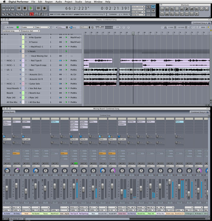
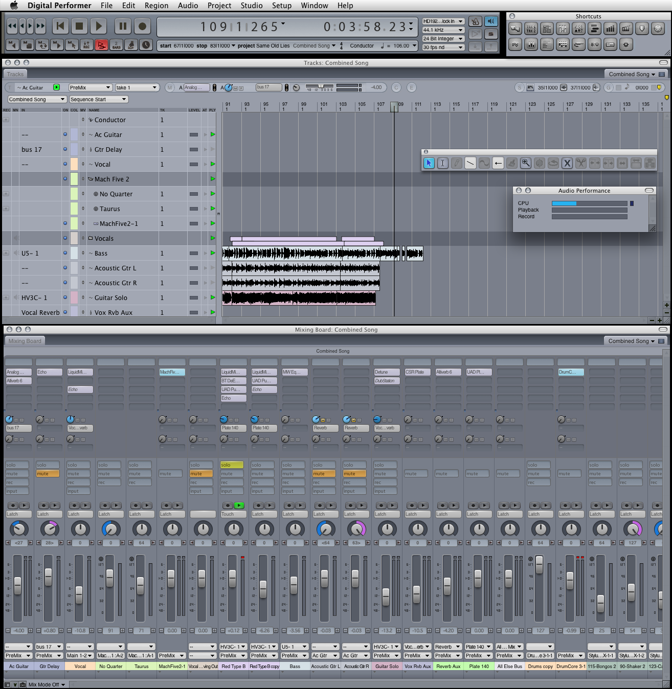
I just did a few of my tweaks to Sharp:
1) Desaturated the activated mute/solo buttons a bit
2) Changed the pan right color to lavender from orange
3) Made the fader and pan value boxes same dark grey as solo/mute buttons when off
4) Used blue for active level meter color and white for peak hold
5) Reverted to v2 shortcut buttons
6) Used blue for VI in inserts
7) Just added the latest translucent fader fix from Andy
Here's a graphic:
JamesSteeleProject.com | Facebook | Instagram | Twitter
Mac Studio M1 Max, 64GB/2TB, macOS Sequoia 15.5 Public Beta 2, DP 11.34, MOTU 828es, MOTU 24Ai, MOTU MIDI Express XT, UAD-2 TB3 Satellite OCTO, Console 1 Mk2, Avid S3, NI Komplete Kontrol S88 Mk2, Red Type B, Millennia HV-3C, Warm Audio WA-2A, AudioScape 76F, Dean guitars, Marshall amps, etc., etc.!
Mac Studio M1 Max, 64GB/2TB, macOS Sequoia 15.5 Public Beta 2, DP 11.34, MOTU 828es, MOTU 24Ai, MOTU MIDI Express XT, UAD-2 TB3 Satellite OCTO, Console 1 Mk2, Avid S3, NI Komplete Kontrol S88 Mk2, Red Type B, Millennia HV-3C, Warm Audio WA-2A, AudioScape 76F, Dean guitars, Marshall amps, etc., etc.!

Re: AmpGUI7 (now at AMPGUIMODS.COM)
Let me see a real png of that and see if those need to be incorporated for real....looks good.
-
James Steele
- Site Administrator
- Posts: 22790
- Joined: Fri Oct 15, 2004 10:01 pm
- Primary DAW OS: MacOS
- Location: San Diego, CA - U.S.A.
- Contact:
Re: AmpGUI7 (now at AMPGUIMODS.COM)
I'll email you a .ZIP with the .PNG and my Supplemental Folder so you can take a look at it firsthand.amplidood wrote:Let me see a real png of that and see if those need to be incorporated for real....looks good.
*DONE* Check your mail!
Last edited by James Steele on Mon Feb 22, 2010 3:31 pm, edited 1 time in total.
Reason: Email sent
Reason: Email sent
JamesSteeleProject.com | Facebook | Instagram | Twitter
Mac Studio M1 Max, 64GB/2TB, macOS Sequoia 15.5 Public Beta 2, DP 11.34, MOTU 828es, MOTU 24Ai, MOTU MIDI Express XT, UAD-2 TB3 Satellite OCTO, Console 1 Mk2, Avid S3, NI Komplete Kontrol S88 Mk2, Red Type B, Millennia HV-3C, Warm Audio WA-2A, AudioScape 76F, Dean guitars, Marshall amps, etc., etc.!
Mac Studio M1 Max, 64GB/2TB, macOS Sequoia 15.5 Public Beta 2, DP 11.34, MOTU 828es, MOTU 24Ai, MOTU MIDI Express XT, UAD-2 TB3 Satellite OCTO, Console 1 Mk2, Avid S3, NI Komplete Kontrol S88 Mk2, Red Type B, Millennia HV-3C, Warm Audio WA-2A, AudioScape 76F, Dean guitars, Marshall amps, etc., etc.!
Re: AmpGUI7 (now at AMPGUIMODS.COM)
I think with those tweaks that this version looks *to me* to be a serious contender for a default DP GUI replacement. It's so clear and so modern looking.
-
James Steele
- Site Administrator
- Posts: 22790
- Joined: Fri Oct 15, 2004 10:01 pm
- Primary DAW OS: MacOS
- Location: San Diego, CA - U.S.A.
- Contact:
Re: AmpGUI7 (now at AMPGUIMODS.COM)
You did all the heavy lifting. I just made some little tweaks. I can tell you though that it's going to be MY default GUI from here on out!amplidood wrote:I think with those tweaks that this version looks *to me* to be a serious contender for a default DP GUI replacement. It's so clear and so modern looking.
JamesSteeleProject.com | Facebook | Instagram | Twitter
Mac Studio M1 Max, 64GB/2TB, macOS Sequoia 15.5 Public Beta 2, DP 11.34, MOTU 828es, MOTU 24Ai, MOTU MIDI Express XT, UAD-2 TB3 Satellite OCTO, Console 1 Mk2, Avid S3, NI Komplete Kontrol S88 Mk2, Red Type B, Millennia HV-3C, Warm Audio WA-2A, AudioScape 76F, Dean guitars, Marshall amps, etc., etc.!
Mac Studio M1 Max, 64GB/2TB, macOS Sequoia 15.5 Public Beta 2, DP 11.34, MOTU 828es, MOTU 24Ai, MOTU MIDI Express XT, UAD-2 TB3 Satellite OCTO, Console 1 Mk2, Avid S3, NI Komplete Kontrol S88 Mk2, Red Type B, Millennia HV-3C, Warm Audio WA-2A, AudioScape 76F, Dean guitars, Marshall amps, etc., etc.!
Re: AmpGUI7 (now at AMPGUIMODS.COM)
If we could just change the color of fonts those data wells would be perfect. The numbers are very hard for me to read with that color though. If I could just lighten the damn fonts!!! I love everything else tho. How funny that the blue meters actually work in this color scheme.
I'm going to lighten the data wells a bit and release this as v4.
I'm going to lighten the data wells a bit and release this as v4.
-
James Steele
- Site Administrator
- Posts: 22790
- Joined: Fri Oct 15, 2004 10:01 pm
- Primary DAW OS: MacOS
- Location: San Diego, CA - U.S.A.
- Contact:
Re: AmpGUI7 (now at AMPGUIMODS.COM)
Hey Andy... just found a bug though. I don't know what's causing it.amplidood wrote:If we could just change the color of fonts those data wells would be perfect. The numbers are very hard for me to read with that color though. If I could just lighten the damn fonts!!! I love everything else tho. How funny that the blue meters actually work in this color scheme.
I'm going to lighten the data wells a bit and release this as v4.
Create a new instrument track with a VI. Now select the VI on the insert of the Instrument track and delete it. The insert slot stays blue and does not return to the gray! ?? Oops!
JamesSteeleProject.com | Facebook | Instagram | Twitter
Mac Studio M1 Max, 64GB/2TB, macOS Sequoia 15.5 Public Beta 2, DP 11.34, MOTU 828es, MOTU 24Ai, MOTU MIDI Express XT, UAD-2 TB3 Satellite OCTO, Console 1 Mk2, Avid S3, NI Komplete Kontrol S88 Mk2, Red Type B, Millennia HV-3C, Warm Audio WA-2A, AudioScape 76F, Dean guitars, Marshall amps, etc., etc.!
Mac Studio M1 Max, 64GB/2TB, macOS Sequoia 15.5 Public Beta 2, DP 11.34, MOTU 828es, MOTU 24Ai, MOTU MIDI Express XT, UAD-2 TB3 Satellite OCTO, Console 1 Mk2, Avid S3, NI Komplete Kontrol S88 Mk2, Red Type B, Millennia HV-3C, Warm Audio WA-2A, AudioScape 76F, Dean guitars, Marshall amps, etc., etc.!
Re: AmpGUI7 (now at AMPGUIMODS.COM)
Through some great tweaks with our venerable moderator, I present Sharp 7.1v4.
-
KEVORKIAN
- Posts: 1042
- Joined: Thu Jul 06, 2006 10:21 pm
- Primary DAW OS: MacOS
- Location: I'm your Huckleberry
Re: AmpGUI7 (now at AMPGUIMODS.COM)
Thank you Amplidood and James for getting this one together!
Sharp is my new default GUI. It's really pro looking, crystal clear, and all of the most needed info jumps out at you while the rest stays in the background.
Plus you somehow made liberal use of pastel colors and totally I don't hate it, which is really messing with me
Sharp is my new default GUI. It's really pro looking, crystal clear, and all of the most needed info jumps out at you while the rest stays in the background.
Plus you somehow made liberal use of pastel colors and totally I don't hate it, which is really messing with me
dp7.2 || os 10.6.7 || 2x2.8 (eight core) intel mac pro, 16gb ram || metric halo uln-8 || motu traveler || euphonix mc control || waves mercury || abbey road bundle || mh channelstrip || toontrack sd 2.0, ez drummer, drumtracker || addictive drums || drumcore 3 || ni komplete 5 || reason || bidule || altiverb 6 || omnisphere, stylus RMX || melodyne 3.2 || stillwell || soundtoys || nomad factory|| psp || mpressor || dsm ||
-
James Steele
- Site Administrator
- Posts: 22790
- Joined: Fri Oct 15, 2004 10:01 pm
- Primary DAW OS: MacOS
- Location: San Diego, CA - U.S.A.
- Contact:
Re: AmpGUI7 (now at AMPGUIMODS.COM)
Hey I like v.4 Andy, and definitely like the slightly lighter text boxes for volume and pan info on the mixing board.
Here's what I'm doing for my own version though:
1) I'm still going to swap back the shortcut buttons from version 3. Just not crazy about the colored shortcut buttons... although... shouldn't those level indicators on the short cuts be blue now? hehehe...
2) Using the less saturated solo/mute/rec buttons on the mixing board as in the version I sent you
3) I'm going to make the selected too icon buttons more teal than blue to sort of fit with the other blue highlights.
4) Also thinking of making the inserts presets slot same grey as the fader/pan value boxes in the mixing board/
All in all though I've found my home.
Last edited by James Steele on Mon Feb 22, 2010 6:34 pm, edited 1 time in total.
Reason: Added item #4
Reason: Added item #4
JamesSteeleProject.com | Facebook | Instagram | Twitter
Mac Studio M1 Max, 64GB/2TB, macOS Sequoia 15.5 Public Beta 2, DP 11.34, MOTU 828es, MOTU 24Ai, MOTU MIDI Express XT, UAD-2 TB3 Satellite OCTO, Console 1 Mk2, Avid S3, NI Komplete Kontrol S88 Mk2, Red Type B, Millennia HV-3C, Warm Audio WA-2A, AudioScape 76F, Dean guitars, Marshall amps, etc., etc.!
Mac Studio M1 Max, 64GB/2TB, macOS Sequoia 15.5 Public Beta 2, DP 11.34, MOTU 828es, MOTU 24Ai, MOTU MIDI Express XT, UAD-2 TB3 Satellite OCTO, Console 1 Mk2, Avid S3, NI Komplete Kontrol S88 Mk2, Red Type B, Millennia HV-3C, Warm Audio WA-2A, AudioScape 76F, Dean guitars, Marshall amps, etc., etc.!
Re: AmpGUI7 (now at AMPGUIMODS.COM)
I just love the thought that's going into all that, James. Different perspectives eventually work together to make a masterpiece.
I tried a bit of a middle ground between your muted buttons and the originals, which is what ended up in v4. I think the idea to match up the tool highlight is really good.
I tried a bit of a middle ground between your muted buttons and the originals, which is what ended up in v4. I think the idea to match up the tool highlight is really good.
-
James Steele
- Site Administrator
- Posts: 22790
- Joined: Fri Oct 15, 2004 10:01 pm
- Primary DAW OS: MacOS
- Location: San Diego, CA - U.S.A.
- Contact:
Re: AmpGUI7 (now at AMPGUIMODS.COM)
Already done, Andy! I'm going to email you my Supplemental and large PNG like last time. Here's the small version of the screenshot.amplidood wrote:I just love the thought that's going into all that, James. Different perspectives eventually work together to make a masterpiece.
I tried a bit of a middle ground between your muted buttons and the originals, which is what ended up in v4. I think the idea to match up the tool highlight is really good.
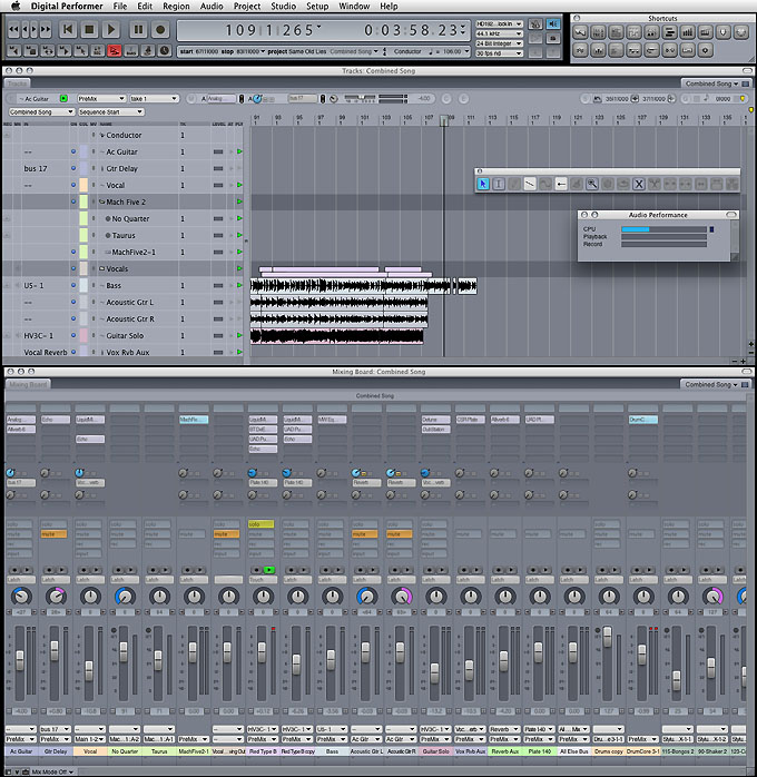
And here's a link to the full size PNG:
http://www.jamessteele.com/unicornation ... rp4big.png" onclick="window.open(this.href);return false;
Again, I'm using "Pastels 2" for the DP color scheme and in the Appearance Control Panel I'm using the overall Graphite look and using "Graphite" for the Highlight Color.
Last edited by James Steele on Mon Feb 22, 2010 7:06 pm, edited 1 time in total.
Reason: Corrected link to big PNG graphic
Reason: Corrected link to big PNG graphic
JamesSteeleProject.com | Facebook | Instagram | Twitter
Mac Studio M1 Max, 64GB/2TB, macOS Sequoia 15.5 Public Beta 2, DP 11.34, MOTU 828es, MOTU 24Ai, MOTU MIDI Express XT, UAD-2 TB3 Satellite OCTO, Console 1 Mk2, Avid S3, NI Komplete Kontrol S88 Mk2, Red Type B, Millennia HV-3C, Warm Audio WA-2A, AudioScape 76F, Dean guitars, Marshall amps, etc., etc.!
Mac Studio M1 Max, 64GB/2TB, macOS Sequoia 15.5 Public Beta 2, DP 11.34, MOTU 828es, MOTU 24Ai, MOTU MIDI Express XT, UAD-2 TB3 Satellite OCTO, Console 1 Mk2, Avid S3, NI Komplete Kontrol S88 Mk2, Red Type B, Millennia HV-3C, Warm Audio WA-2A, AudioScape 76F, Dean guitars, Marshall amps, etc., etc.!