Posted: Mon Jul 07, 2008 7:17 pm
Wow. Its so... uh, beige.MIDI Life Crisis wrote:... I sense a slight learning curve -mattymac1000 wrote: <showing off and torturing the rest of us...>
MOTUNATION (formerly UnicorNation) is an independent community for discussing Digital Performer and other MOTU audio software and hardware. It is not affiliated with MOTU.
https://www.motunation.com/forum/
Wow. Its so... uh, beige.MIDI Life Crisis wrote:... I sense a slight learning curve -mattymac1000 wrote: <showing off and torturing the rest of us...>
Cool! Thanks. And the snappiness factor???mattymac1000 wrote:
If you know DP5, you'll know DP6 - no problem.
How about "Far out, solid and right on!?"zed wrote:I'm still waiting to hear words like "zippier" and "cool" and "friggin' fantastic".
But is it groovy? I need it to be groovy.midilance wrote:How about "Far out, solid and right on!?"zed wrote:I'm still waiting to hear words like "zippier" and "cool" and "friggin' fantastic".

I have my confirmation. Unfortunately I live on the coast opposite from MOTU headquarters, so the carrier pigeon they use to ship isn't scheduled to arrive here until the 14th of July.bkshepard wrote:So, I'm out at the mailbox checking the mail when the UPS driver pulls up and says he has a package for me. My little heart starts to go pitter-patter. Unfortunately, it was a wall hanging for our entryway.mattymac1000 wrote:For anyone who is feeling left out, here is a comforting thought: I just received DP6 and 1.) I never got a confirmation shipping email and 2.) my credit card has yet to be charged.
So sit tight, it might come with no warning.
-matt
That's good to know. I haven't gotten a confirmation yet and will be performing out of town this weekend, so no distractions from my show... RATS!billf wrote: I have my confirmation. Unfortunately I live on the coast opposite from MOTU headquarters, so the carrier pigeon they use to ship isn't scheduled to arrive here until the 14th of July.
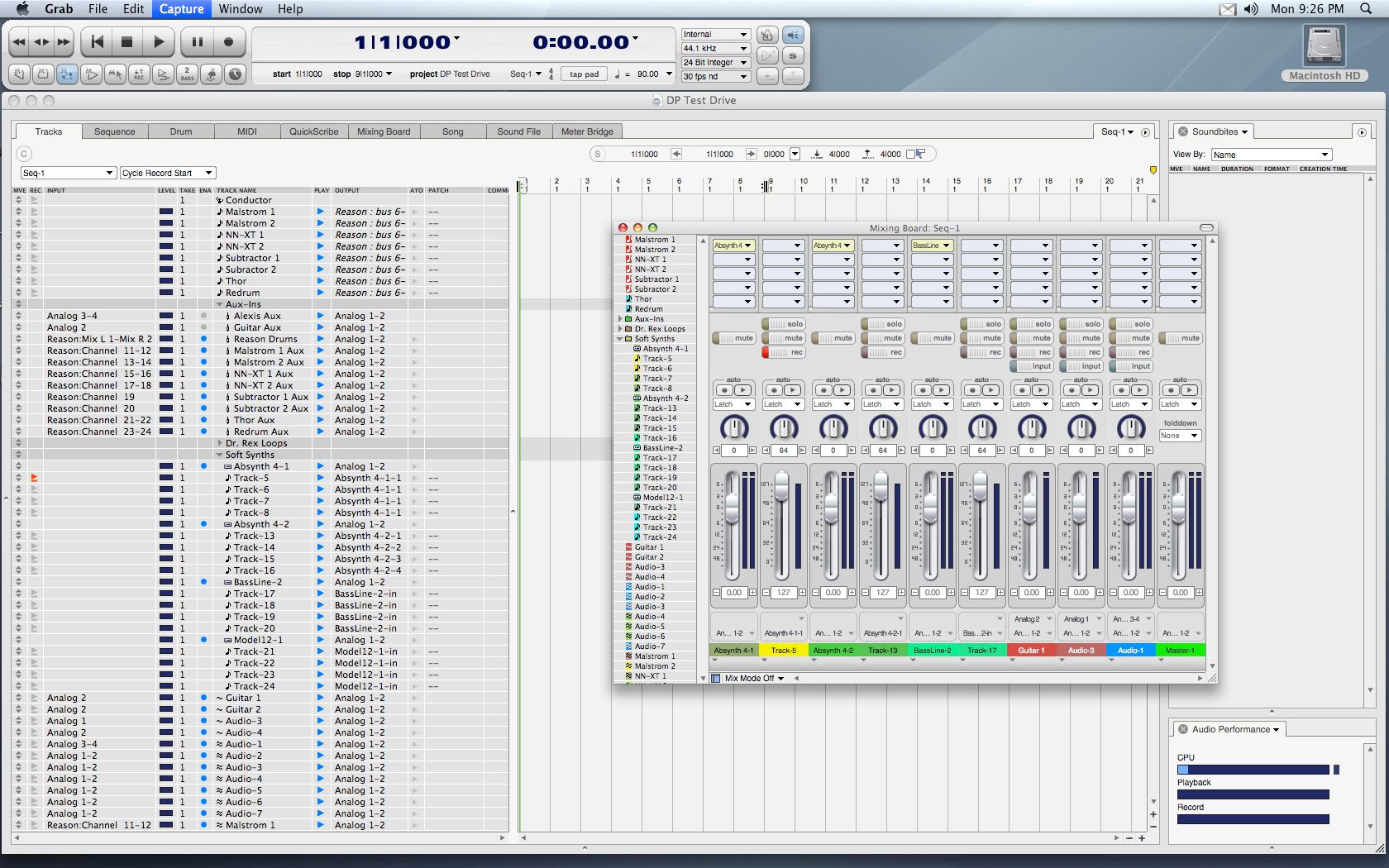
I think I know what the problem is. The old mixer had clearly divided vertical lines along every channel -- it just made it easier to digest, visually. Here, there's nothing clearly dividing each channel, everything's just smashed together. The UI designers should have continued the dividing lines for the insert section all the way down the channel.RCory wrote:the mixer does look a little, huh, busy... though..