They say that most shades of green are the most pleasant to the human eye.ramadev wrote:Some folks don't see green all that well due to male pattern color blindness, so blue may actually work better for those folks...FWIW.grimepoch wrote:Look how well the green pops out with all the other colors. You can VERY EASILY see the levels going on. with the blue, and the addition of blank space between the level bars on the meter bridge, everything is SO MUCH harder to see with all the other noise going on of colors (especially with the fader graphics)
But yeah, green is better...
not crazy about the white GUI
Moderator: James Steele
Forum rules
This forum is for seeking solutions to technical problems involving Digital Performer and/or plug-ins on MacOS, as well as feature requests, criticisms, comparison to other DAWs.
This forum is for seeking solutions to technical problems involving Digital Performer and/or plug-ins on MacOS, as well as feature requests, criticisms, comparison to other DAWs.
Great family and friends!
Mac Studio M2 Max, MacPro 8 core (trashcan), MacBook Pro 16 in 2023, OSX Ventura, DP 11, Pro Tools, Logic Pro X, Motu 112D, 24Ao, 8M, 896 MKIII, UA Apollo 16, Waves Horizon, Slate Everything Bundle, Plugin Alliance Bundle, UAD-2 Satellite DSP Accelerator, UAD Apollo Twin.
Native Instruments Komplete 14 Ultimate, Console 1 MKIII w/C1 Fader
"Without struggle, there is no progress"
F. Douglas
-
Eleventh Hour Sound

- Posts: 1920
- Joined: Fri Feb 03, 2006 7:50 pm
- Primary DAW OS: MacOS
- Location: Southern California
- Contact:
Imagine a baby blue ball field...argggkwiz wrote:They say that most shades of green are the most pleasant to the human eye.ramadev wrote:Some folks don't see green all that well due to male pattern color blindness, so blue may actually work better for those folks...FWIW.grimepoch wrote:Look how well the green pops out with all the other colors. You can VERY EASILY see the levels going on. with the blue, and the addition of blank space between the level bars on the meter bridge, everything is SO MUCH harder to see with all the other noise going on of colors (especially with the fader graphics)
But yeah, green is better...
DP11.1, 16" MacBookPro 2.3Ghz 8 Core i9's 32GB Ram 1TB SSD, (2) external 1TB Samsung SSD's , Steven Slate SSD 5.5 and Trigger Drums, ML-1 Mic and VSX Headphones, Omnisphere 2, Trilian, Ivory2, EW, MSI, MX-4, Philharmonik 2, Komplete, Reason, Live, Melodyne, IK Multi's Total Studio, ARC, T-RackS, SampleTron, AMG's KickA--Brass. and my beloved guitars 
-
Spikey Horse

- Posts: 1841
- Joined: Wed Aug 24, 2005 1:50 pm
- Primary DAW OS: Unspecified
That new mixer has got to go IMHO! No question. It, and other GUI issues, are seriously putting me off upgrading.
And fair play to MOTU if they do admit (by changing it) that they made a big mistake.
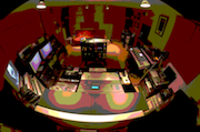
The fact that we saw a different mixer on their site must mean that it was a pretty last minute job anyway - surely? .. in fact it's still there on the very first page of the DP6 features tour. Note the green meters.
http://www.motu.com/products/software/d ... fullscreen
Kwiz's comparison (thanks for posting that) really brings it home, what strikes me is just how could MOTU possibly think this is a step forward?!?!? I mean how many 'OK's' must have been given to the designs to get what we have ended up with through into the final version - it's not just annoying but, to me utterly perplexing how it could have happened!
I can't find one change that doesn't make it harder to see what is going on, more fatiguing on the eyes, more infuriating, more of a waste of space, .. OK one niggle here or there, sure ... but when it's everything....
The old mixer manages to be 10x easier on the eyeballs and everything you need to know leaps out at you out with no effort involved.
By comparison this new mixer is like having three people talking to you at once!!! It is like reading a book with no paragraphs- in all caps! It is like looking at a glossy laptop screen outside next to a white washed wall on a sunny day at midday somewhere near the equator. It is like ... well you get the picture ...
Please MOTU:
- Make it less eye piercing
- Give it some depth and more to the point give it proper 3-D / 2-D consistency ..... the real world is 3-D, it looks great! Let's have a bit of that throughout (rather than the conflicting 'made by two designers' look). I'm not saying photo realistic just, natural and easy on the eye.
- Old style green/yellow/red level metering really, really works PLEASE bring it back (for all windows) or give us the choice. (And not 'green on a green' background either like you've done here with the 'blue on blue' look )
)
- Please don't make it take up MORE space for NO GOOD REASON.
- Bring back dividing lines.
- Please loose all the irrelevant button detain and 'stuff' you've added which just clutter things up - look at the mute/ solo area and the pan knobs for example. 'At a glance' it is not!
- Please take a moment to study the comparison DP5 vs DP6 mixer on the page before this and see how much and why the old one just works (not perfect but it works) and just look at what you have done to it in DP6!
And fair play to MOTU if they do admit (by changing it) that they made a big mistake.
The fact that we saw a different mixer on their site must mean that it was a pretty last minute job anyway - surely? .. in fact it's still there on the very first page of the DP6 features tour. Note the green meters.
http://www.motu.com/products/software/d ... fullscreen
Kwiz's comparison (thanks for posting that) really brings it home, what strikes me is just how could MOTU possibly think this is a step forward?!?!? I mean how many 'OK's' must have been given to the designs to get what we have ended up with through into the final version - it's not just annoying but, to me utterly perplexing how it could have happened!
I can't find one change that doesn't make it harder to see what is going on, more fatiguing on the eyes, more infuriating, more of a waste of space, .. OK one niggle here or there, sure ... but when it's everything....
The old mixer manages to be 10x easier on the eyeballs and everything you need to know leaps out at you out with no effort involved.
By comparison this new mixer is like having three people talking to you at once!!! It is like reading a book with no paragraphs- in all caps! It is like looking at a glossy laptop screen outside next to a white washed wall on a sunny day at midday somewhere near the equator. It is like ... well you get the picture ...
Please MOTU:
- Make it less eye piercing
- Give it some depth and more to the point give it proper 3-D / 2-D consistency ..... the real world is 3-D, it looks great! Let's have a bit of that throughout (rather than the conflicting 'made by two designers' look). I'm not saying photo realistic just, natural and easy on the eye.
- Old style green/yellow/red level metering really, really works PLEASE bring it back (for all windows) or give us the choice. (And not 'green on a green' background either like you've done here with the 'blue on blue' look
- Please don't make it take up MORE space for NO GOOD REASON.
- Bring back dividing lines.
- Please loose all the irrelevant button detain and 'stuff' you've added which just clutter things up - look at the mute/ solo area and the pan knobs for example. 'At a glance' it is not!
- Please take a moment to study the comparison DP5 vs DP6 mixer on the page before this and see how much and why the old one just works (not perfect but it works) and just look at what you have done to it in DP6!
Last edited by Spikey Horse on Sun Jul 13, 2008 11:23 am, edited 2 times in total.
content is the new style
kwiz,
You could gain at least a little bit of vertical space in your layout by clicking on the window title bar's collapse button (top right). Then you can use command-click and control click on the collapse button to access the mini-menu and target window menu.
Maybe that could help a little?
You could gain at least a little bit of vertical space in your layout by clicking on the window title bar's collapse button (top right). Then you can use command-click and control click on the collapse button to access the mini-menu and target window menu.
Maybe that could help a little?
Martin Nadeau
Mac Pro 8-core, Mac OS 10.5.6, DP 6.02, MIDI Express XT USB, MOTU 2408, MOTU 308
Mac Pro 8-core, Mac OS 10.5.6, DP 6.02, MIDI Express XT USB, MOTU 2408, MOTU 308
-
Tritonemusic

- Posts: 2749
- Joined: Fri Oct 15, 2004 10:01 pm
- Primary DAW OS: MacOS
Wow. What a great post, SH. You truly read my mind on every point you make. Seriously, I can't believe how you took the words right out of my mouth.Spikey Horse wrote:That new mixer has got to go IMHO! No question. It, and other GUI issues, are seriously putting me off upgrading.
And fair play to MOTU if they do admit (by changing it) that they made a big mistake.
The fact that we saw a different mixer on their site must mean that it was a pretty last minute job anyway - surely? .. in fact it's still there on the very first page of the DP6 features tour. Note the green meters.
http://www.motu.com/products/software/d ... fullscreen
Kwiz's comparison (thanks for posting that) really brings it home, what strikes me is just how could MOTU possibly think this is a step forward?!?!? I mean how many 'OK's' must have been given to the designs to get what we have ended up with through into the final version - it's not just annoying but, to me utterly perplexing how it could have happened!
I can't find one change that doesn't make it harder to see what is going on, more fatiguing on the eyes, more infuriating, more of a waste of space, .. OK one niggle here or there, sure ... but when it's everything....
The old mixer manages to be 10x easier on the eyeballs and everything you need to know leaps out at you out with no effort involved.
By comparison this new mixer is like having three people talking to you at once!!! It is like reading a book with no paragraphs- in all caps! It is like looking at a glossy laptop screen outside next to a white washed wall on a sunny day at midday somewhere near the equator. It is like ... well you get the picture ...
Please MOTU:
- Make it less eye piercing
- Give it some depth and more to the point give it proper 3-D / 2-D consistency ..... the real world is 3-D, it looks great! Let's have a bit of that throughout (rather than the conflicting 'made by two designers' look). I'm not saying photo realistic just, natural and easy on the eye.
- Old style green/yellow/red level metering really, really works PLEASE bring it back (for all windows) or give us the choice. (And not 'green on a green' background either like you've done here with the 'blue on blue' look
- Please don't make it take up MORE space for NO GOOD REASON.
- Bring back dividing lines.
- Please loose all the irrelevant button detain and 'stuff' you've added which just clutter things up - look at the mute/ solo area and the pan knobs for example. 'At a glance' it is not!
- Please take a moment to study the comparison DP5 vs DP6 mixer on the page before this and see how much and why the old one just works (not perfect but it works) and just look at what you have done to it in DP6!
DP 10.13, OS 13.7.6, iMac Pro (2017) 3.2 GHz 8-Core, 32 GB RAM, MOTU M4
nadeama,nadeama wrote:kwiz,
You could gain at least a little bit of vertical space in your layout by clicking on the window title bar's collapse button (top right). Then you can use command-click and control click on the collapse button to access the mini-menu and target window menu.
Maybe that could help a little?
Thank you, that did help a bit. Now hopefully Motu will read Spikey Horse's post. He hit it on the head. I have DP 6 open as I type and even with my color profile modified to make DP6 less washed out, I still wish that the 3-D graphic and dividing lines were included.
I make a full time living using DP and I can literally see (no pun intended) certain clients complaining about how bright 6 looks. Again, even with the color profile adjustment, 6 is to bright and as Shooshie stated in another post, some gray shading is needed.
Ultimately, we all love DP and want it to look appealing, be compatible with all of our VI's and plugins that worked with 5.13, and most importantly, stability!
Come on Motu, hook us up for 6.01.
Magic Dave, I know you're out there.
Great family and friends!
Mac Studio M2 Max, MacPro 8 core (trashcan), MacBook Pro 16 in 2023, OSX Ventura, DP 11, Pro Tools, Logic Pro X, Motu 112D, 24Ao, 8M, 896 MKIII, UA Apollo 16, Waves Horizon, Slate Everything Bundle, Plugin Alliance Bundle, UAD-2 Satellite DSP Accelerator, UAD Apollo Twin.
Native Instruments Komplete 14 Ultimate, Console 1 MKIII w/C1 Fader
"Without struggle, there is no progress"
F. Douglas
Mac Studio M2 Max, MacPro 8 core (trashcan), MacBook Pro 16 in 2023, OSX Ventura, DP 11, Pro Tools, Logic Pro X, Motu 112D, 24Ao, 8M, 896 MKIII, UA Apollo 16, Waves Horizon, Slate Everything Bundle, Plugin Alliance Bundle, UAD-2 Satellite DSP Accelerator, UAD Apollo Twin.
Native Instruments Komplete 14 Ultimate, Console 1 MKIII w/C1 Fader
"Without struggle, there is no progress"
F. Douglas
-
monkey man

- Posts: 14096
- Joined: Fri Apr 22, 2005 10:01 pm
- Primary DAW OS: MacOS
- Location: Melbourne, Australia
This is one of those times when a word from MOTU concerning its thinking about where it's headed and why would be manna from Heaven, IMHO. 
Mac 2012 12C Cheese Grater, OSX 10.13.6
MOTU DP8.07, MachFive 3.2.1, MIDI Express XT, 24I/O
Novation, Yamaha & Roland Synths, Guitar & Bass, Kemper Rack
Pretend I've placed your favourite quote here
-
Timeline
- Posts: 4910
- Joined: Tue Nov 09, 2004 10:01 pm
- Primary DAW OS: MacOS
- Location: Fort Atkinson Hebron, Wisconsin...
- Contact:
I don't even have mine yet but it's the same routine I would think as 5.13.666 wrote:I don't need a copy of DP6 to know that this is going to put me in a bad situation. I already wear very dark prescription shades, since getting meningitis. In fairness, I guess my situation is unique. Still, I can only hope that MOTU will consider this in a future update.mongoose wrote:Fair enough...my copy's supposed to arrive tomorrow, I guess I'll go out and buy some new mixing sunglasses.taylor12k wrote:i liked it too... i'm all for the white and minimalist look... but, in practice, i fear it's just too bright...
Gary B. (Timeline), if you read this, let us know if you are going to change DP6's color scheme like you did with DP5. I seem to recall you changed colors of various parts of the Mixing Board window. If there is a way to tone down the overall look of DP6, it would make all the difference in the world to me.
I don't want DP6 to look like Logic or anything but, this blaring white look is pure torture for me.
Select DP icon,/showpackagecontents/contents/resources/English.lproj/images/openthem in Photoshop CS2 or later and mod the png files without changing name when saved. The names may be different though, don't know. Find the png files and open them and figure out what they represent in 6. Remember the glogs control the area of the graphic on pages of icons when grouped together. I would not mess with these.
Copy complete component original folder first and save on desktop before you do any of this or you may end up having to reload DP6.
It may not be there BTW as MOTU surely noticed our messing about with DP5. I know that Nuendo hid them somehow.
Good luck!
-
Timeline
- Posts: 4910
- Joined: Tue Nov 09, 2004 10:01 pm
- Primary DAW OS: MacOS
- Location: Fort Atkinson Hebron, Wisconsin...
- Contact:
ALso, I don't mind taking more room had they had break away's. That's my complaint and what about longer more resolute faders? Maybe they STILL don't think our computers can handle the additional data?
Ya know motu, that's what prefs are for.
BTW, RME supports customer redo's on their graphics and even has a thread dedicated to it showing how to access.
Ya know motu, that's what prefs are for.
BTW, RME supports customer redo's on their graphics and even has a thread dedicated to it showing how to access.
2009 Intel 12 core 3.46, 64GB, OSX.10.14.6, Mojave, DP11, MTPAV, Key-station 49,(2) RME FF800,
DA-3000 DSF-5.6mhz, Mackie Control. Hofa DDP Pro, FB@ http://www.facebook.com/garybrandt2
DA-3000 DSF-5.6mhz, Mackie Control. Hofa DDP Pro, FB@ http://www.facebook.com/garybrandt2
-
Eleventh Hour Sound
- Posts: 1920
- Joined: Fri Feb 03, 2006 7:50 pm
- Primary DAW OS: MacOS
- Location: Southern California
- Contact:
I agree and feel better at least knowing that I'm not the only one with such strong feelings about these changes. Notice that a normal bit of work may that you sometimes have to go to the corners of your screen to get at things that were previously closer together.Spikey Horse wrote:That new mixer has got to go IMHO! No question. It, and other GUI issues, are seriously putting me off upgrading.
And fair play to MOTU if they do admit (by changing it) that they made a big mistake.
The fact that we saw a different mixer on their site must mean that it was a pretty last minute job anyway - surely? .. in fact it's still there on the very first page of the DP6 features tour. Note the green meters.
http://www.motu.com/products/software/d ... fullscreen
Kwiz's comparison (thanks for posting that) really brings it home, what strikes me is just how could MOTU possibly think this is a step forward?!?!? I mean how many 'OK's' must have been given to the designs to get what we have ended up with through into the final version - it's not just annoying but, to me utterly perplexing how it could have happened!
I can't find one change that doesn't make it harder to see what is going on, more fatiguing on the eyes, more infuriating, more of a waste of space, .. OK one niggle here or there, sure ... but when it's everything....
The old mixer manages to be 10x easier on the eyeballs and everything you need to know leaps out at you out with no effort involved.
By comparison this new mixer is like having three people talking to you at once!!! It is like reading a book with no paragraphs- in all caps! It is like looking at a glossy laptop screen outside next to a white washed wall on a sunny day at midday somewhere near the equator. It is like ... well you get the picture ...
Please MOTU:
- Make it less eye piercing
- Give it some depth and more to the point give it proper 3-D / 2-D consistency ..... the real world is 3-D, it looks great! Let's have a bit of that throughout (rather than the conflicting 'made by two designers' look). I'm not saying photo realistic just, natural and easy on the eye.
- Old style green/yellow/red level metering really, really works PLEASE bring it back (for all windows) or give us the choice. (And not 'green on a green' background either like you've done here with the 'blue on blue' look
- Please don't make it take up MORE space for NO GOOD REASON.
- Bring back dividing lines.
- Please loose all the irrelevant button detain and 'stuff' you've added which just clutter things up - look at the mute/ solo area and the pan knobs for example. 'At a glance' it is not!
- Please take a moment to study the comparison DP5 vs DP6 mixer on the page before this and see how much and why the old one just works (not perfect but it works) and just look at what you have done to it in DP6!
Last edited by Eleventh Hour Sound on Sun Jul 13, 2008 1:02 pm, edited 1 time in total.
DP11.1, 16" MacBookPro 2.3Ghz 8 Core i9's 32GB Ram 1TB SSD, (2) external 1TB Samsung SSD's , Steven Slate SSD 5.5 and Trigger Drums, ML-1 Mic and VSX Headphones, Omnisphere 2, Trilian, Ivory2, EW, MSI, MX-4, Philharmonik 2, Komplete, Reason, Live, Melodyne, IK Multi's Total Studio, ARC, T-RackS, SampleTron, AMG's KickA--Brass. and my beloved guitars
-
Eleventh Hour Sound
- Posts: 1920
- Joined: Fri Feb 03, 2006 7:50 pm
- Primary DAW OS: MacOS
- Location: Southern California
- Contact:
That would be really nice. Just some sort of acknowledgment that they hear us and will take it into consideration. I would really be curious to know the background of what the thought process was that brought about these changes. Did OSX require that they change things up like they did? Is it a work in progress?monkey man wrote:This is one of those times when a word from MOTU concerning its thinking about where it's headed and why would be manna from Heaven, IMHO.
DP11.1, 16" MacBookPro 2.3Ghz 8 Core i9's 32GB Ram 1TB SSD, (2) external 1TB Samsung SSD's , Steven Slate SSD 5.5 and Trigger Drums, ML-1 Mic and VSX Headphones, Omnisphere 2, Trilian, Ivory2, EW, MSI, MX-4, Philharmonik 2, Komplete, Reason, Live, Melodyne, IK Multi's Total Studio, ARC, T-RackS, SampleTron, AMG's KickA--Brass. and my beloved guitars
-
chucks
It looks like a work in progress. A good deal of the color/shades/fonts of the interface are controlled by a single XML document. They may be transitioning to more options or just leaving the door open for some creative types. If you're familiar with the app structure/programming, it's easy to check out.RecordingArts wrote: That would be really nice. Just some sort of acknowledgment that they hear us and will take it into consideration. I would really be curious to know the background of what the thought process was that brought about these changes. Did OSX require that they change things up like they did? Is it a work in progress?
Last edited by chucks on Sun Jul 13, 2008 8:18 pm, edited 1 time in total.
-
Mr. Quimper

- Posts: 751
- Joined: Tue Jul 18, 2006 6:24 pm
- Primary DAW OS: MacOS
Man...I started to look at some in-depth screens of Logic 8. Wow. I have no idea how well I'd adapt to the different work-flow/features, but Logic is now REALLY easy on the eyes. Beautiful in fact.
I can't say if I'd really want to switch or not, but for $500, it's definitely worth giving it a shot. It's worth it for Compressor alone! I've only been using DP for 3 years, so I haven't exactly invested my life in the program.
I dunno. Might be one less Unicorn 'round these parts soon. (not that I'm that essential to this place anyway.
  )
)
I can't say if I'd really want to switch or not, but for $500, it's definitely worth giving it a shot. It's worth it for Compressor alone! I've only been using DP for 3 years, so I haven't exactly invested my life in the program.
I dunno. Might be one less Unicorn 'round these parts soon.
2.5Ghz Quad-Core/20GB DDR3/10.11.6/DP 9.5
-
Timeline
- Posts: 4910
- Joined: Tue Nov 09, 2004 10:01 pm
- Primary DAW OS: MacOS
- Location: Fort Atkinson Hebron, Wisconsin...
- Contact:
On the other side of this topic, I can remember many products that came out I didn't like but we got used to them. The Ampex 124 remote was a nightmare and required a full semester of logic tests to increase your aptitude to use it but we got by. The SSL boards in the beginning had an automation system that was like a pandoras box of unrecognizable , english driving on the wrong side of the street, concepts but it turned out fantastic.
Maybe Shooshi is right, give it a go. I might put my copy on a second drive and take a looksee & listen. I like the fact that there are a few more prefs and I just gotta see what's there. My curiosity is killing me.
Maybe Shooshi is right, give it a go. I might put my copy on a second drive and take a looksee & listen. I like the fact that there are a few more prefs and I just gotta see what's there. My curiosity is killing me.