Page 2 of 26
Posted: Thu Jul 31, 2008 8:20 pm
by dpdan
I would love to vote,
but I STILL don't have my DP6.
MagicD can you look into this?
Thanks,
dpDan
Posted: Thu Jul 31, 2008 9:23 pm
by Timeline
I feel we needed allot of the things it does especially the format choices. wow, that's huge but like Shooshie I'm between an E & F.
I have posted my opinion at MOTU and got a reply that said they were close to fixing the UAD1 issue but did not really answer the rest but said they passed it on to the developers.
oh except they did say the controller not going to the bottom was Apples issue but didn't explain why you could save it there and reopen the session and it stayed there. It does not work from DP pull down setups. Seems it should to me. I'm not buying it. hmmmm
I also made the point again for the DP5 buttons and pull out window shortcuts as they are shooting themselves in the foot as far as I'm concerned removing them. I suggested a pull down or pull up version of them again and asked for scaleability of the entire controller. Don't really expect scaleability any time soon but it would be nice.
On the pole I would swap e & f in position.
Posted: Thu Jul 31, 2008 11:53 pm
by blue
MIDI Life Crisis wrote:What is it, like 8pt? Who uses fonts that small except the US Treasury and used car salesmen?
Graphic designers?
Posted: Fri Aug 01, 2008 12:06 am
by Frodo
MIDI Life Crisis wrote:
As they used to say on American Bandstand... "I'll give it a 90."
I voted F but should have voted E as well.
Isn't 90 is a high score for E and F: "I don't like it"?

Posted: Fri Aug 01, 2008 1:27 am
by Shooshie
A little buzz that's been going on in my mind:
Early on I said they should have hired Jonathan Ive to design the interface. Then I realized that it is very much in the direction that Ive probably would have taken it. Here's an analogy for you: WALL-E, the Pixar movie. WALL-E was old school. A robot with panels, buttons, and the stuff that made him work was all visible on the outside. Then along comes EVE. Turns out that EVE was designed by none other than Jonathan Ive. She's clean with no lines. Her "arms" don't seem to be attached. Her movements are a mystery. Nothing about her reveals her purpose or her secrets. She is blank, except for the little bit of personality designed into her interface panel, which mainly shows her emotions with a pair of eyes. Ive's Eve's Eyes.
DP just leaped from the WALL-E look to the EVE look. What little personality is left in it comes from its control panel and its track colors. The rest is just function -- there when you need it, gone when you don't. Sort of.
Maybe I'm just more of a WALL-E kind of guy. I like seeing visual relationships on the screen. I've designed a lot of newsletters in my life. Somehow I'm always the guy chosen to do the newsletters for various professional and volunteer organizations to which I've belonged. I've tried a lot of looks, but I have always ended up inserting graphic elements to guide the eyes where I want people to look. There are some graphic elements in DP6, but I'd prefer more, and with more depth. I don't want to just look at something all day. I want to be in it. Working inside it.
Shoosh
Posted: Fri Aug 01, 2008 1:57 am
by Frodo
666 wrote:Too bad there's not a 2D vs. 3D option. I vote 3D all the way (even though I know I can't actually vote for that). To me, 2D feels and looks CHEAP while 3D looks PRO.
I'm just sayin'...

At some point, someone thought these were cool:
http://static.kvraudio.com/i/b/aulab.jpg
http://www.maketunes.com/system/files/i ... review.jpg
Seemed to kick in right around the time the trend in the *cool* websites got rid of 3D click buttons and went for flat 2D basic shapes, usually square. That was about when websites in general got away from the ATM look and opted for Flash styles "back in the" early 2000s. (Remember that decade? LOL!)
Dunno. Finale did some odd things with its newer skins with some rather gaudy, melted candy-looking icon concepts, but at least they included a diversity of skins, including the original Finale look.
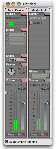
I really haven't formed an opinion about the DP6 design one way or another. I don't hate it, but I don't love it. No biggie, because I feel the same way about the look of DP5: indifferent. I've always just wanted it to be easy to use and not to be a distraction. Once that issue has been fully addressed and has proven itself in form and function FIRST, maybe then I'll start thinking more about how it might be dressed up or toned down.
2D can have a simple sophistication if it's done just right, but that's a huge if. 3D is easier on the eyes, but perhaps a higher-res 3D would help, too.
Then there's this which implies that some balance between old and new was attempted:

Posted: Fri Aug 01, 2008 2:29 am
by Shooshie
Eek! That looked better on a CRT monitor. It's just too sharp for LCD. It needs shadings. That's what I want. Shadings. And you know what? DP6 HAS shadings. In fact, it's not so bad.
Can I change my vote? The more I talk about it, the less I dislike it. I'm not sure what I'd change. Maybe it's just the functions of some lost buttons. But the look really isn't bad.
Why do I even bother to form an opinion? It just changes a few minutes later!
Shooshie
Posted: Fri Aug 01, 2008 4:43 am
by Frodo
Shooshie wrote:Eek! That looked better on a CRT monitor. It's just too sharp for LCD.
Strange-- it looks sort of grainy on my Apple Cinema.
Speaking of lo-res-- was it my imagination or did the electric green "reading project" progress bar in 6 look smeared?
Posted: Fri Aug 01, 2008 6:09 am
by monogee
I do not like the way MachFive's interface looks when opened up inside of DP6. It just doesn't look right.
Posted: Fri Aug 01, 2008 7:13 am
by MIDI Life Crisis
Frodo wrote:MIDI Life Crisis wrote:
As they used to say on American Bandstand... "I'll give it a 90."
I voted F but should have voted E as well.
Isn't 90 is a high score for E and F: "I don't like it"?
Well yes, it is... er... was... but I don't remember anyone on thew show ever giving anything but a 90 for any record. Of course, I was only about 6 when the show ran and most of my info was filtered thru my teen idol rock star sister (from the Shagri Las).
Posted: Fri Aug 01, 2008 8:11 am
by monkey man
Guess the flood of Aussie votes will ensue after DP6 arrives here. Still on the banana boat, AFAICT.
Too early for anyone to reveal the tally so far? I assume you see it after you vote, no?
Posted: Fri Aug 01, 2008 8:39 am
by MIDI Life Crisis
monkey man wrote:Guess the flood of Aussie votes will ensue after DP6 arrives here. Still on the banana boat, AFAICT.
Too early for anyone to reveal the tally so far? I assume you see it after you vote, no?
True, but I'll give the current scores:
VOTES: 8, 9, 11, 12, 19, 20
PERCENTAGES: 10%, 11%, 13%, 15%, 24%, 25%
Note: Not in order of the questions asked.

Posted: Fri Aug 01, 2008 9:01 am
by monkey man
Bugger.

Naughty gorilla - you're teasing the monkey again!
Posted: Fri Aug 01, 2008 9:55 am
by Brian Middleton
Shooshie wrote:
DP just leaped from the WALL-E look to the EVE look. What little personality is left in it comes from its control panel and its track colors. The rest is just function -- there when you need it, gone when you don't. Sort of.
Having just seen WALL-E last week, I love this analogy. I really didn't dig EVE much as a design, but the animators were able to do very expressive things with her. The problem is, I don't want my GUI to do expressive things. When it comes to GUI's I'm like an old-school sexist husband: I don't want it to have its own agenda, I just want it to lie there and think about my needs.
I'm not at all wedded to the current (long-standing) DP look & feel; actually I was eagerly awaiting a cleaner, sleeker, smoother DP. But I'm not liking what I've seen so far. I don't have DP6 yet, so maybe I'll find this look more satisfactory when I'm actually using it. But based on what I've seen here, I voted E.
Posted: Fri Aug 01, 2008 9:58 am
by MIDI Life Crisis
I'm still stuck wondering about the black disks, black splash screen and the white interface. Not exactly consistency in marketing.